Are you a public transport professional?

How do you want to improve your station?

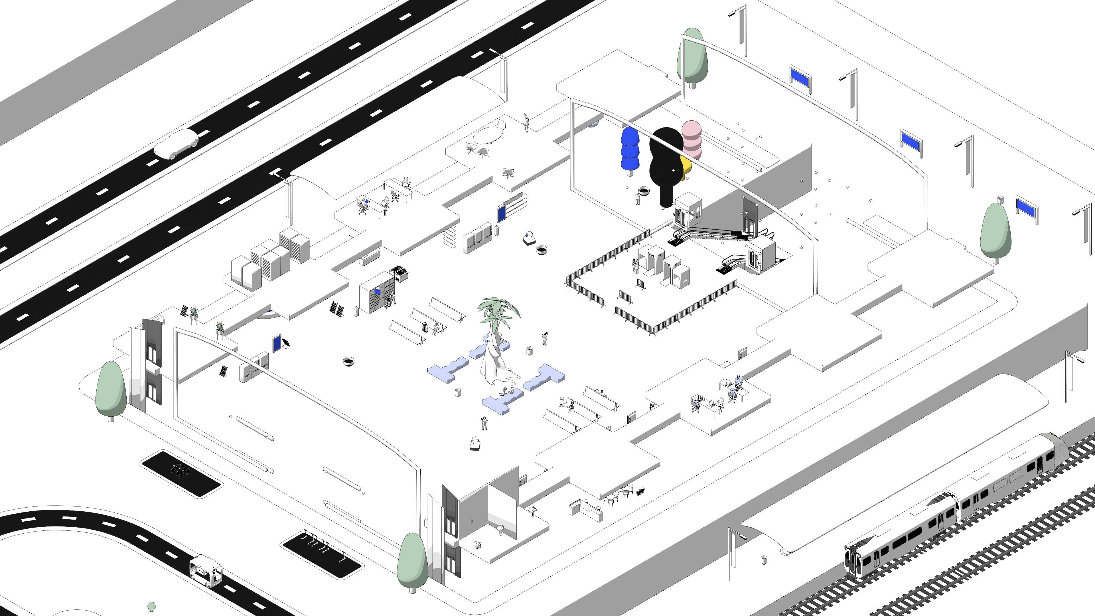
Welcome to the heart of the interactive Stations of the Future. Here, we invite you to explore the solutions we have identified to make public transport stations better, more inclusive places.
Improving connectivity with the surrounding urban environment

VISIBLE DIFFERENCE BETWEEN PUBLIC AND FARE AREA

Managing people flows

‘People Flow & Wayfinding’

WHY

As a station is not simply for those traveling – it can be for anyone using the services in the building – the different areas need to be clearly marked.

WHAT

Fare areas, especially in those stations without ticket gates, should be made highly visible and clear to all users. This will avoid any confusion or dispute

WIDE TICKET GATES

Managing people flows

‘People flow & Accessibility’

WHY
Passengers may be going to an airport, pushing their child in a buggy, or requiring a wider ticket gate for their mobility device to pass through.

WHAT
There should always be at least one ticket gate that is accessible to those who might need wider access to the ticketed area. For those with reduced mobility, in particular, this ticket gate should be easily found from the entrance.

TICKET GATE SPEED

Managing people flows

People Flow

WHY
Passengers want to get to their destination as quickly as possible. Sometimes, however, going too fast can cause more issues by creating overcrowding at points that might not be able to cope with the flow.

WHAT
Timing gates that can operate slightly slower or faster, either acceptably or imperceptibly to the traveler, can improve the flow to the platform(s), increasing safety and comfort for passengers.

DEDICATED SECURITY LANE FOR PASSENGERS WITH LUGGAGE

Enhancing station amenities for better user well-being
‘Customer support

Managing people flows
‘People Flow & Reducing Frustration’

WHY

Station users would like to pass through security with the minimum of disruption and without frustration, such as being behind those with (large) items of luggage.

WHAT

Dedicated luggage security lanes should be implemented. This will allow for the segregation of users according to security requirements. This can lead to greater efficiency by allowing station managers to know where to concentrate resources.

QUEUE BARRIERS

Managing people flows

‘People Flow & Reducing Frustration’

WHY
Users often want to know where the queue starts.

WHAT
In order to coordinate the people flow in front of ticket gates or security checkpoints, installing barriers to guide people could be considered, particularly during peak hours or major events.

DIRECTING USERS VIA A DIFFERENT ROUTE

Managing people flows
‘People Flow & Reducing Frustration’

WHY
Passengers prefer to move, rather than wait in a queue that leads to potential congestion in certain areas.

WHAT
Sometimes, there can be more than one way for passengers to reach their destination within the station. Directing them via the longer (or shorter) route can allow the system just enough time to deal with crowding and provide a more comfortable journey. In underground stations in particular, users may not notice that they are taking a longer route.

DEFINED WALKING DIRECTIONS
Managing people flows

‘Wayfinding & People Flow’


WHY

Station users would like to move smoothly through as station and avoid conflicts with others.


WHAT

Regulating the direction that station users are moving in will reduce conflict points and provide a smoother journey for all. Physical infrastructure, floor markings, or lights could help clarify the walking directions and are more intuitive for station users.

BOLLARDS TO REDIRECT PEOPLE WITH LARGE ITEMS OF LUGGAGE

Managing people flows

‘People Flow & Reducing Frustration’

WHY

Removing obstacles in a station user’s path will reduce congestion in large people flows. Luggage or luggage trolleys can be difficult to maneuver and can constrict flow.

WHAT

Restrictions in the form of bollards at strategic locations can stop larger items of baggage from passing through. Alternative routes should be provided if these items are allowed on the vehicle. Care should be taken so that the bollards themselves do not become obstacles.

COLOUR CODING TO GUIDE STATION USERS

Managing people flows

‘People Flow & Reducing frustration’

WHY

Stations, particularly main transfer hubs, are often large and pose issues for navigating. Underground stations have the additional difficulty that above ground landmarks are not visible. Simple and understandable directions are required for users, particularly for those who may not speak the local language, are illiterate or may need more straightforward information.

WHAT

Colours could be used in floor design, in the walls or in the signage system. It has the added benefit of potentially making transfers for commuters faster, as colour coded guides are often quicker to  comprehend than text.

FAST LANES
Managing people flows

‘People Flow & Reducing Frustration’


WHY
For station users who know where they are going and how to get there, a minor disruption can have a major impact on their perceived time spent traveling.


WHAT
Segregating faster and slower users via a fast and slow lane can allow those traveling quickly to make their way through the station more efficiently. Slower users can then move at their own pace.

SIGNAGE TO DIRECT TO STAIRS AS ALTERNATIVE TO ESCALATORS

Managing people flows

‘People Flow & Wayfinding’

WHY

A healthy option for some, quicker for others, users may follow the crowd to the escalators when stairs might also be available as a suitable option.

WHAT

For shorter vertical distances, stairs provide an option for those who are able to bypass crowds on escalators. Signs can also be supplemented by campaigns promoting a healthy lifestyle and the impact of taking the stairs as an alternative.

WAITING TIMES FOR ELEVATORS

Managing people flows

Allowing users to feel in control of information and reducing frustration

WHY

Users appreciate knowing the waiting time for an elevator to feel in control of their journey.

WHAT

For elevators that are not visible, it can be difficult for the user to understand when the next elevator will arrive. Indicators such as floor level can sometimes support this. However, if the elevator is running a service that is fixed (for example, stopping at all floors or only between very distant levels) the next elevator can be displayed. This will reduce the perceived wait time.

SMART ELEVATORS AND ESCALATORS

Managing people flows

‘Accessibility, People Flow & Reducing Frustration’

WHY
Less downtime of infrastructure ensures accessibility, and people flow and reduces frustration.

WHAT
Connected elevators and escalators as well as other installations can be continuously monitored to ensure their availability. Monitoring and identifying problems in real-time allows timely and swift corrective maintenance as well as any predictive or preventive maintenance. This helps minimize disruptions in people flow and dissatisfaction.

Automatic elevator landings can be programmed to wait at certain floors, or – in a fully connected station – autonomously take into consideration people flow when, for example, a train or bus enters a station or when connected to other machines such as robots or wheelchairs.

EVEN THE DISTRIBUTION OF PASSENGERS

Managing people flows

‘Wayfinding & People Flow’

WHY

Passengers might not be able to see the full length of the platform and thus do not use it efficiently.

WHAT

Floor markings indicating that passengers should move away from the entry point can be used. They can guide passengers to use the entire boarding zone available and help to avoid crowds. Another solution is to nudge passengers by putting services or retail options that attract them farther from the entry point.

INDICATE TRAIN OCCUPANCY

Managing people flow

‘People Flow & Allowing Users to Feel in Control’

WHY

Understanding the occupancy level of the arriving vehicle is useful for a passenger to know what to expect.

WHAT

Harnessing data available from vehicles can provide information on the train occupancy, nudging passengers to less crowded areas of the vehicle. This results in a smoother boarding and alighting process and for passengers to perceive being more in charge of their journey.

INDICATE POSITION OF ONBOARD FACILITIES

Managing people flows

‘Information’

WHY

In preparation for boarding, passengers should have information on the facilities and layout of their vehicle.

WHAT

Screens and timetables can indicate the composition of the vehicle and the location of on-board facilities so that passengers can know in advance what will be available, and where. In addition, platforms can be marked or signposted to indicate the location of specific carriages or vehicles, allowing passengers to stand in the appropriate location for efficient boarding and disembarking.

REVERSIBLE ESCALATOR

Managing people flows

‘People Flow & Reducing Frustration’

WHY

Vertical circulation is essential in certain locations, such as underground stations, particularly for those traveling upwards. Large flows can mean longer waits and crowding.

WHAT

A group of three escalators can be set up to have two operating with the flow and one in the opposite direction. When the flow changes, one of the escalators will also change, making more efficient use of available infrastructure.

In a connected station, real-time monitoring of people flows can allow the escalators to warn the operator of the situation or adapt autonomously such as preparing for a change in people flow when a vehicle enters the station.

ICONIC STATION IDENTIFIER

Improving connectivity with the surrounding urban environment

‘Wayfinding’ 

WHY

Station users need to easily identify the entrance into a network. Some may be confused by the various signs due to information noise, mainly if there are several for a single station. This is especially important for those less users familiar with the area.

WHAT

A single identifier, common to all stations in the area, will help indicate the station entrance. This identifier must be recognizable from a distance and unified throughout the entire public transport system. This can also be useful for avoiding promoting one operator over another and can be used in marketing to make the system even more identifiable.

DEDICATED DROP-OFF AREAS FOR SHARED MOBILITY

Improving connectivity with the surrounding urban environment

‘Intermodality’

WHY

People may arrive at the station via other transport means, needing to park or drop off vehicles to continue their journey.

WHAT

Dedicated drop-off zones should be provided for the shared vehicle services available in the area. In order to promote sustainable mobility and to make efficient use of the available urban space, environmentally friendly transport modes, and shared services should be prioritized.

SIGNAGE FOR PARKING AND DROP-OFF POINTS FOR TRANSPORT ALTERNATIVES.

Improving connectivity with the surrounding urban environment

‘Information’

WHY

Certain stations may not be within the reach of other modes, and users will need to travel by car. Information should be provided on topics such as the number of spaces, opening hours, and prices.

WHAT

Information about parking should be made available either online or clearly on the road before arriving at the station; it should also be well signposted in the station. Real-time information can be provided by small inset screens on road signs. The same information should also be provided for alternative modes. Information for modes such as car sharing, ride-hailing, scooter/bicycle charging points, or demand-responsive transit can be provided inside stations, where these options exist.

DEDICATED ENTRANCE AND EXIT

Improving connectivity with the surrounding urban environment

‘People Flow’

WHY

Station users must be able to enter the station without encountering any obstacles, including conflicting flows of people that might create congestion.

WHAT

A solution to avoid congestion is to separate people flow by having clearly identifiable, dedicated entrances and exits. This can help to reduce the number of conflict points in the people flow, particularly during peak hours.

Clear demarcation of entrances and exits, using lights or small barriers that change in real-time, can manage people flows dynamically.

ACCESSIBLE ENTRANCES (PRM)


Improving connectivity with the surrounding urban environment 

‘Accessibility’


WHY

People with reduced mobility should be able to access the station via at least one entrance, preferably via all. These entrances should also be kept in good condition, particularly where there are no alternative accessible entrances.

WHAT

Ideally, PT systems should be fully accessible and adapted to all people, including those with reduced mobility. In addition to being fully accessible, stations should also be cleaned and maintained regularly to ensure a pleasant travel experience for all users, free of any unpleasant smells or discomfort.


As this is not always the case, any entrance dedicated to people with reduced mobility should be identified indicating the path to the platform and vehicle with any details on blocked routes shared with users in advance. Multiples of each piece of equipment should be available.

BIKE ENTRANCE

Improving connectivity with the surrounding urban environment

‘Intermodality & People Flow’

WHY

Station users should be aware of the suitable entrances and paths when moving through the station with a bike.

WHAT

Providing a dedicated entrance from a bike parking area can encourage more cyclists to use the station, while also reducing conflict points between users at entrances.

ARCHITECTURE

Improving connectivity with the surrounding urban environment

‘Comfort & Information

WHY

Architecture can be either off-putting or attractive and is a requirement to welcome people.

WHAT

Station design can be inspired, by their local surroundings, to have a greater connection with the outside world. For locals, it can be helpful for orientation and it can be a way to show off what is available nearby for visitors. During construction, historical items may be uncovered and spaces in the station can be used as an archaeological museum.

QR CODE FOR ACCESS TO MORE INFORMATION

Improving connectivity with the surrounding urban environment

‘Information & Wayfinding’

WHY
Visitors and locals alike may not be aware of nearby locations, restaurants, shops, events, or landmarks.

WHAT
QR codes (stickers) at strategic places can provide a source of information about events or opening times of landmarks, which people can download and take with them.

As a digital source, it also means that the user can select the language of the information.

ADVERTISING NEARBY EVENTS AND LANDMARKS

Improving connectivity with the surrounding urban environment

‘Information’

WHY

Station users may be interested in events or new opportunities that are available around them, with the spaces in stations very valuable for the numbers that can be reached.

WHAT

Promotional material can help support cultural events taking place nearby and may have otherwise been overlooked. This promotion can take many forms, such as digital displays, posters, brochures, or announcements over the PA system.

Advertisements can help to promote local businesses and provide extra income for the station. For example, transport operators and authorities could work with local restaurants or hotels to offer discounts or promotions for users who attend a particular event or landmark.

TIME-SENSITIVE DIRECTIONS TO SPECIAL EVENTS

Improving connectivity with the surrounding urban environment

Wayfinding and people flow

WHY

The station users for events might not be familiar with the station near the stadium, theatre, or other event space.

WHAT

During events, additional clear information should be available. Real-time data with time-sensitive directions can allow users to be more aware of options.

DIRECTIONS TO CONNECTING SERVICES


WHY

Passengers require information on how to continue their journey with other services and connecting modes.


WHAT

Signage should be at visible and strategic places both inside and outside the station to show directions to any connections or alternative modes.

DEPARTURE INFORMATION FOR CONNECTING SERVICES RESEARCH


WHY

Passengers require real-time information to understand their journey or organize alternatives.


WHAT

Passengers should be provided with dynamic information indicating departure times.

MAP AND VISUALISATION OF SURROUNDINGS

Improving connectivity with the surrounding urban environment

‘Wayfinding & Information

WHY

Users need to know which direction they would need to go – a line of sight to some local surroundings can help.

WHAT

Where possible, the surroundings should be visually represented, in a way that is understood by all. An example could be indicating directions by using the different surroundings of a station such as a park, the city center, or a museum district – with signs reflecting these as travelers might not know the names, areas, or streets.

HIGHLIGHT CONNECTING PATHS TO MAJOR LANDMARK

Improving connectivity with the surrounding urban environment

Wayfinding & Information

WHY

Stations are the gateways to certain areas and landmarks, so it is important that stations have reliable indications of what can be found outside

WHAT

For those unfamiliar with the area and whose destination might be the landmark, wayfinding, and information about the surrounding area needs to be provided in the station to help orient people and direct them to their destination.

PICTOGRAMS TO SUPPORT WAYFINDING TO EXITS

Improving connectivity with the surrounding urban environment

‘Wayfinding & Information

WHY

Users should be aware of which exit to use to leave the station.

WHAT

Pictograms of landmarks on the respective exit signs provide users with a clear sense of direction, from the moment they alight onto the platform.

USER AWARENESS FOR STAIR/ESCALATOR USE

Enhancing station amenities for better user well-being

 ‘Safety’

WHY

In areas where escalators are either new or part of normal life, users might have bad habits that can also be dangerous to themselves or other users.

WHAT

Users should be informed to have good habits when using stairs and escalators via nudging techniques or by more explicit campaigns and solutions. Dynamic lighting using colours can be used on the steps of an escalator, indicating where to stand. This ensures people know where to step, maintains the distance between people and when to get off. More interactive solutions can include using artificial intelligence to inform users of their inappropriate use and indicate alternatives to stop accidents before they happen. Screens on escalators (and elevators) can be used to provide additional safety information and/or wayfinding.

INCLINED ELEVATORS

Enhancing station amenities for better user well-being

‘Accessibility, People Flow’

WHY
Station users who need to use an elevator might sometimes need to go a different and longer direction.

WHAT
Incline elevators can be used to provide an alternative way of moving vertically. Often installed alongside escalators or stairs, they take advantage of already existing space without the need for an elevator shaft, improving accessibility across the station. Inclined elevators are therefore an ideal solution for stations where an additional lift shaft may not be feasible or might have an impact on station layout by making it more complicated.

AWARENESS OF OUT-OF-ORDER EQUIPMENT

Enhancing station amenities for better user well-being

‘Information, Accessibility & Reducing Frustration

WHY

In advance of their arrival at the station, users should be made aware of the status of facilities that may have an impact on their visit, particularly those linked to accessibility.

WHAT

Before arrival at the station, information should be available online as to the status of essential facilities such as elevators or toilets and alternative arrangements where needed. This allows users to feel more in control of their journey and to feel supported knowing that alternatives are available. Real-time information could be shared within the app and taken into account in travel planners to provide a personalised journey.

SENSORS TO DETECT FALLS

Enhancing station amenities for greater user well-being

‘Safety’

WHY

Passenger safety, particularly at the intersection between platforms and the tracks/road, should be monitored.

WHAT

Sensors or cameras can identify a passenger who has fallen on the tracks, stop traffic inform those who need to be involved, and automatically stop the appropriate systems.

PLATFORM SCREEN DOORS

Enhancing station amenities for better user well-being

‘Safety & Comfort’

WHY

Users would prefer to have platforms that are not noisy, have proper ventilation, and are at the same time safe, particularly when crowded.

WHAT

Platform screen doors separate the travelers from the vehicle, which helps to avoid accidents. Other benefits are that noise from the vehicles can be reduced, and ventilation and air-conditioning can be more easily controlled.

TIME/DISTANCE TO PLATFORM INDICATIONS

Enhancing station amenities for better user well-being

‘Wayfinding & Allowing Users to Feel in Control’

WHY

Having a relatable way to understand the station allows station users to plan their movements within its confines.

WHAT

Walking distance/time to the platform should be indicated, to allow passengers to plan how and when they will move through the station. Departure information does not need to be the same across the whole station. At various locations, it may be appropriate to remove information about the next departures when it is no longer possible to reach the vehicle without rushing.

SHELTER TO CREATE A WEATHERPROOF ZONE

Enhancing station amenities for better user well-being 

‘Comfort’

WHY

Station users should be protected from the weather when entering and exiting the station.


WHAT

Station exits and entrances should have a shelter extending out from the building for those entering or maybe waiting for a connecting mode of transport. Depending on the climate, this can be a simple awning structure as protection from the rain to a more substantial structure protecting users from high temperatures or heavy rainfall.

CHARGING POINTS

Enhancing station amenities for better user well-being

‘Comfort & Information’

WHY
With the implementation of digital tools and particularly payment/wayfinding apps, users are at risk of low batteries and need power for their mobiles.

WHAT
Charging points for mobile phones and other devices should be provided at the station.

PROJECTORS

Enhancing station amenities for greater user well-being

‘Information & Wayfinding’

WHY

Information, particularly of a type that may be new, dynamic, or potentially important for somewhere that might impact people flow, should be provided in innovative ways that do not cause any physical obstructions but can still gain the user’s attention.

WHAT

Innovative solutions for providing information can be to use a projection – either still or animated – to guide people to their destination. This could also potentially indicate departure times or advertise services or retail outlets in the station.

DIGITAL DISPLAYS

Enhancing station amenities for greater user well-being

‘Information & Wayfinding’

WHY

Station users, particularly passengers, need clear and real-time information.

WHAT

Digital displays provide dynamic information to passengers. Information overload and confusion should be avoided.

MULTIPLE PAYMENT OPTIONS
Enhancing station amenities for better user well-being

‘Alternatives & People Flow’


WHY
Passengers should have the option to pay using the widest range of options possible.


WHAT
Numerous forms of payment should be accepted. Queues at ticket vending machines or service counters can be reduced if passengers can pay for their journey in advance, or pay directly at ticket gates with bank cards or mobile phones.

USER-FRIENDLY TICKET VENDING MACHINES

Enhancing station amenities for better user well-being

‘Accessibility & Reducing Frustration’

WHY

Ticket machines should be user-friendly and intuitive.

WHAT

Ticket vending machines need to be intuitive in order to reduce frustration, and queues and make reliance on support of staff unnecessary. Instructions should be clear and concise, displays readable and interfaces should offer a choice of languages.

REMOTE SUPPORT FOR TICKET VENDING MACHINES

Enhancing station amenities for better user well-being

‘Customer Support & Reducing Frustration’

WHY

Support for using ticket vending machines is essential.

WHAT

If no staff are present, ticket vending machines should offer the possibility to connect with a member of staff, who can then provide personalized support and assistance.

NOTIFICATIONS FOR LOW JOURNEYS/EXPIRING TICKETS

Enhancing station amenities for better user well-being

‘Allowing Users to Feel in Control & Information’

WHY
Travelers should be informed about low credit balances or expiring journeys on their transport tickets when it is not easily visible.

WHAT
Notifications via an app linked to a customer account can inform travelers about their tickets. It should have the option to automatically top up or show where to do it nearby.

CUSTOMER SERVICE CENTRE

Enhancing station amenities for better user well-being

‘Comfort & Customer Support’

WHY

While some users like – and are able to use – digital tools, others need or prefer more personalized assistance with human interaction.

WHAT

Customer service centers should be available at major hubs or central stations to be accessible to the maximum number of station users. Where station staff is present, they should be properly trained in communicating with users and travelers. Staff speaking multiple languages should be prioritized; however, as it is impossible for staff to know all languages, communication methods using clear pictograms/diagrams or other tools should be available, to ensure that the user still feels comfortable using the network.

MOBILE INFORMATION STANDS FOR EVENTS/ON-DEMAND

Enhancing station amenities for better user well-being

‘Allowing passengers to Feel in Control, Accessibility, and Customer support’

WHY

Not all stations have the same facilities such as staff service centers, which act as a point of contact between the user and the network operator. It may be inconvenient for users of a station without a staffed service center to reach a station that would have one. Other users may be put off using the station without support.

WHAT

A mobile stand can provide a similar service to the customer center, without the need for fixed infrastructure. In addition to a more fixed agenda of locations for the mobile stands, they could be set up for a limited time when/where needed for specific events, for example, sporting events, concerts, or markets.

VOLUNTEER/AMBASSADOR PROGRAMME
SUPPORTING THOSE NEEDING A BIT MORE HELP

Enhancing station amenities for better user well-being

‘Allowing passengers to Feel in Control, Accessibility, and Customer support’

WHY

Sometimes, a station user with different needs may require a bit more support and may have different ways of understanding what is happening.

WHAT

Volunteers from relevant associations or trained ambassadors from the staff can provide support, preparing those who may need extra help to be able to feel

INSTRUCTORS TO EXPLAIN DIGITAL TOOLS

Enhancing station amenities for better user well-being
‘Customer Support & Allowing Passengers to Feel in Control’

WHY

The use of digital tools is growing in public transport, and some users need support in learning how to use them.

WHAT

Digital tools should be user-friendly and have an intuitive interface; however, some people may need some extra help to use them. Trained instructors can be made available to help passengers understand, in a human and comprehensible way, how to use travel planners, ticketing apps, and other innovative solutions.

HEATING, VENTILATION AND AIR CONDITIONING (HVAC)

Enhancing station amenities for better user well-being

‘Comfort’

WHY
Indoor and underground areas can at times be highly uncomfortable and make people feel claustrophobic, as can being surrounded by many other users.

WHAT
Heating Ventilation and Air-Conditioning (HVAC) are essential for making people feel comfortable (temperature-wise) and safe (ventilation/airborne disease-wise).

SILENT ZONES

Enhancing station amenities for better user well-being

‘Comfort’

WHY

Station users who may need somewhere to concentrate, or who may need a moment away from the hustle and bustle of the station, need a place to get away.

WHAT

Silent zones could be created and indicated in order to provide a calmer space for station users who prefer or need such a space.

SOUNDSCAPES AND MUSIC

Enhancing station amenities for better user well-being

‘Comfort’

WHY

A station can be uncomfortable for some users and certain soundscapes can be very loud or unwelcoming.

WHAT

Cutting through the announcement, birdsong or waves can provide a more welcoming environment. Music can also provide a more homely feel. More upbeat music in the morning to get those traveling prepared, and calmer music in the evening to help people feel safer and discourage antisocial behaviors.

DESIGN FOR ACOUSTIC LEVELS

Enhancing station amenities for better user well-being

‘Comfort’

WHY
Stations can be noisy places – the number of people, the announcements and the vehicles can make it impossible to hear clearly what needs to be heard.

WHAT
Sound-absorbing materials or designs and art structures can help reduce noise, minimize echo, and give more acoustic space to essential sounds such as announcements.

MORE (NATURAL) LIGHT AND GREEN SPACES

Enhancing station amenities for greater user well-being

‘Comfort’

WHY

Underground areas in particular can feel very removed from nature and rather unwelcoming.

WHAT

(Natural) light is an important and simple way of creating changes in emotions. (Natural) light and green spaces provide a calming and inviting atmosphere and will mean that users are more likely to feel at ease. This can be achieved through installing skylights or light wells that allow natural light to enter the station and incorporating plants and greenery into the station’s design. Using reflective surfaces can help maximize the distribution of natural light throughout stations.

SOURCE OF DRINKING WATER

Enhancing station amenities for better user well-being

‘Comfort’

WHY

Hydration is of great importance and those with refillable bottles need locations to refill them.

WHAT

Simple solutions such as a source of drinking water can increase the comfort and appreciation of a station at a low cost.

ENTERTAINMENT IN WAITING AREAS

Enhancing station amenities for better user well-being

‘Comfort’

WHY

While waiting, station users require some level of entertainment to make the perceived waiting time seem shorter.

WHAT

Waiting areas should provide some form of entertainment, potentially in the form of TVs and reading materials. This ensures that these passengers do not obstruct those who need to move through the station. It also provides a more centralized point where information can be shared with the waiting passengers. Entertainment

CLEAR LINES OF SIGHT

Enhancing station amenities for better user well-being

‘People Flow, Wayfinding & Allowing Users to Feel in Control’

WHY

Users need to be able to see where they need to go – even approximately – can help with wayfinding through the station.

WHAT

Where possible, a direct line of sight from origin to destination within the building is ideal. This allows station users to make decisions based on estimating the times and distances that they can travel. Users will feel more comfortable knowing that they can see exactly where they need to go. Retail or additional signage should not detract from the clear lines of sight.

LIGHTING

Enhancing station amenities for better user well-being

‘Comfort & Safety’

WHY
Users need station lighting to be bright enough to feel safe and secure, as any areas of darkness or shadows may create safety concerns.

WHAT
The station should be lit appropriately to ensure that station users do not feel unsafe.

The lighting should also be well-maintained and free of flickering, which can cause discomfort and headaches. Additionally, the color temperature of the lighting should be carefully chosen to create a welcoming and comfortable atmosphere, with warmer temperatures promoting relaxation and cooler temperatures promoting alertness.

DIGITAL CONNECTIVITY

Enhancing station amenities for better user well-being

‘Comfort & Information’

WHY
Network users should have access to a strong mobile phone signal in order to avoid feeling disconnected or unable to work, as well as being able to access the digital travel/station application available.

WHAT
In addition to communication systems for operational purposes, operators should ensure coverage for station users; digital information on station services, timetables, the local area, and payment all rely on connectivity.

CO-WORKING AREAS

Enhancing station amenities for better user well-being

‘Additional Services’

WHY

COVID-19 has increased the number of people working from home, with some missing the social nature of the office.

WHAT

Co-working areas can provide a base for those who can work away from the office. Ideal locations for these, Stations are often easy to reach, making them ideal locations. It is also a financial opportunity for stations to take advantage of their often central locations and already-existing infrastructure.

SHOPPING FACILITIES

Enhancing station amenities for better user well-being

‘Additional Services

WHY

This provides convenience for travelers who may need to purchase essentials or souvenirs while on the go.

WHAT

Shops at stations can help meet station users’ needs during their journey and generate additional revenue for the station and surrounding businesses. In order to improve facilities, data from surveys or applications can be used to identify which shops users want to see at the station.

DELIVERY PICK-UP POINTS

Enhancing station amenities for better user well-being

‘Additional Services’

WHY
With online shopping forming a notable part of retail sales, those away from home may need to pick up a delivery.

WHAT
Parcel pick-up points in a station are highly convenient, allowing users to collect parcels on the way to, or from, their office or shopping.

POP-UP CULTURAL OR BUSINESS SPACES

Enhancing station amenities for better user well-being

‘Additional Services’

WHY

For stations to be attractive, users need to have a reason to be in the station. Pop-up culture and business spaces can provide such a solution.

WHAT

Using temporary installations in the waiting area provides an opportunity to highlight neighboring communities, businesses, and activities.

Pop-up spaces or business spaces can provide an opportunity for station users to widen their horizons while in the station. The spaces can also make the station feel more like a destination and a place to be, rather than simply a place to pass through. Links with cultural activities can increase cooperation with the local community and make the station feel connected to users and local inhabitants.

PRESENCE OF STAFF TO HELP

Enhancing station amenities for better user well-being

‘Customer support’

WHY

Users of the station may not be able to find the information needed through the physical or digital tools available. They may need guidance through the gates, particularly where there are technical and other issues. Other users may prefer or need to interact with a human for purchasing tickets and for helping them pass through the ticket gates.

WHAT

Station staff members play a crucial role in reducing queues and congestion by assisting passengers at the gates. They can guide them to other gates or ticket machines if necessary, ensure that they can quickly and easily navigate through the station, as well as solve ticket validation and other problems at gates.

EMERGENCY/INFORMATION POINTS

Enhancing station amenities for better user well-being

‘Safety & Customer Support

WHY

Station users need to have direct contact with the relevant staff member in case of emergency or for information.

WHAT

Emergency/Information points allow people to call for support in the event of emergencies or problems. Alternatives to static points include robots or holograms, which can be more interactive/intuitive for users.